FEATURE
Top 10 Ways to Make a Document Accessible
by Jamie Lin
| It takes less time and energy to create an accessible document than to retroactively redesign it to be accessible. |
You want to comply with federal guidelines and be inclusive, but how do you do this? What simple steps can you take to ensure your document is accessible? Accessibility has become a focus in recent days, especially within technology companies. However, the process of making a document accessible can be confusing and time-consuming, especially for those working with graphic PDF documents or multimedia. For the vast majority of people creating documents in Word or PowerPoint, a little bit of knowledge about accessibility goes a long way.
Here are 10 ways to ensure your document is accessible and provides a successful user experience for everyone.
1. BEFORE EVEN BEGINNING YOUR DOCUMENT, THINK ABOUT HOW A MACHINE WILL READ IT.
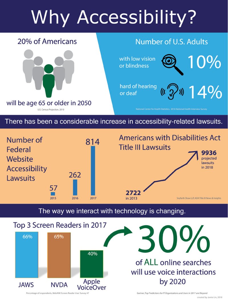
Screen readers (which include software such as JAWS, NVDA, and Apple VoiceOver) scan documents from the top left to the bottom right of a page. While a sighted user can quickly glance at the entirety of a document and focus on the important part, someone listening to the text must go through every line before getting to the action item. Instead of putting very important information at the very end of several paragraphs, include the most relevant information near the beginning or at the start of each paragraph.
2. USE BUILT-IN FORMATTING STYLES TO ALLOW NONSIGHTED USERS TO SCAN THE DOCUMENT WITH THEIR KEYBOARD.
In many text editors today, such as Word or Google Docs, you’ll see formatted style options for headings, normal text, title, etc. By using these formatted styles while you design your document, you create a structure that enables keyboard users to tab through sections of your document—the closest equivalent to the way sighted users use their eyes to quickly scan its contents. After you’ve formatted your text using built-in style options, you can change the visual appearance (font, font size, font decoration) without disturbing the machine-readable structure.
3. USE DESCRIPTIVE LINKS INSTEAD OF PHRASES SUCH AS “CLICK HERE.”
Screen readers will always identify links. Links are elements that are keyboard-navigable—a user who is scanning the article by tabbing through content will hear each link, but may skip preceding text. Make sure that the link’s purpose is clear, even without any surrounding context. For example, “Test your color-contrast here,” instead of “Click this link to see it in action.”
4. USE ALT TEXT FOR IMAGES, OR MARK THEM AS DECORATIVE.
An image that does not contribute necessary information within a document should be labeled decorative or null, which tells a screen reader to skip over it. If the image conveys important meaning, be sure to include that meaning using alt text. There are different ways to do this depending on the program, but generally, right-clicking on the image and choosing Format Picture will bring up alt-text options. Enter the alt text in the description box, not the title box.
5. RUN A COLOR-CONTRAST CHECK.
It’s important to consider contrast between background colors and text colors. Web content accessibility guidelines encourage a minimum ratio of 4.5:1, but for practical purposes, visit an online color-contrast checker, such as the WebAIM color-contrast checker; input your color choices; and receive an instant answer.
6. DO NOT RELY SOLELY ON COLOR TO DIFFERENTIATE CONTENT.
A thoughtful and visually appealing way to ensure your content is accessible to color-blind users is to provide different shapes as well as colors to convey meaning. For instance, if you want an error message to appear in red and a correct answer to appear in green, you may want to include shapes such as a checkmark or an X.
7. RUN AN ACCESSIBILITY CHECK.
No excuses! You’ll find this tool under Review, Tools, or Options, depending on the software you’re using. You can always do a quick search online to find out exactly where it is. The accessibility checker scans for accessibility issues and often provides suggestions for how to correct them. Adobe Acrobat’s accessibility tool offers an opportunity to completely reformat a document for screen readers, changing the reading order or text to deliver a more robust user experience for screen readers. If you work with graphic documents, make a point to become very familiar with the capabilities of Acrobat’s tool.
8. CAPTION VIDEOS.
Captioned videos are extremely helpful for many people, as I’m sure you have experienced when watching Facebook videos with the audio turned off while at work. If you upload a video to YouTube, captioning options include automatic transcription (not recommended due to inaccuracy), manually typing captions using the caption editor, or uploading a caption file. Other video-editing software will include this capability, as well as the ability to create and export a separate caption file.
9. USE DESCRIPTIVE FORM FIELDS AND SLIDE TITLES.
Similar to using descriptive links, make sure your form fields are not labeled Form Field 1. If the field requires a first name, title it First Name and so on. Do this also for PowerPoint slide titles and anywhere you see a generic label such as Text Box 1 or Table 1.
10. AVOID USING TABLES OR HEADINGS FOR VISUAL LAYOUT.
This is a common visual design choice that is incredibly frustrating for those who use screen readers. Instead of using tables to create tidy text documents, use text boxes. Reserve tables for data. Likewise, when creating large text, avoid header tags like <H1>, and create larger text using font size and <strong>. Reserve header tags for keyboard navigation.
You can do it.
Software programs are changing all the time, and the more recent your version, the easier and more robust the accessibility options will be. It takes less time and energy to create an accessible document than to retroactively redesign it to be accessible. Take those few extra minutes to ensure that what you create is usable for everyone.
|


 Jamie Lin, M.L.I.S., is an educational technology designer for a higher-education company, creating innovative, interactive multimedia learning objects for university courses. She is interested in all things related to user-centered design, understanding how people learn and how technology influences learning. Lin has worked in corporate, academic, and public libraries. She serves as the current president of the San Diego Chapter of SLA.