 |
| Vol.
19 No. 1 — Jan/Feb 2005 |
Customer-Based Marketing
Retail Interior Layout for Libraries
by Christie Koontz
My favorite grocery store offers a wonderful
space of orientation upon entry. The wide doors
open, and to the immediate right is free coffee
plus copy and soft drink machines. To the left is
check cashing, an ATM machine, and, for better or
worse, Florida lottery tickets. Several yards ahead
to the right are specialty foods (organic), and
to the left, seasonal promotional items. The wide
right-hand turn (that favors a world of right-handed
people) sweeps you to toiletry and cosmetic items,
dairy foods, and aisles of canned and packaged goods.
The tour finishes with frozen foods and fresh bakery
items, then checkout. The store offers convenience
while communicating daily and seasonal products
to customer markets. This grocery chain effectively
employs the principles of retail interior layout.
Why don't libraries?
What Retail Stores and Libraries Have in
Common
We could benefit immensely from applying tried-and-true
retail practices, especially since we have so
much in common.
 Organizational Goals: The overriding
goal of most retail stores and libraries is to
maximize the number of customers and profits.
For libraries, profit is measured in the use of
services and materials.
Means of Attracting Customers: The principal
means of attracting customers is similar for retailers
and librarians. They include the nature and size
of the product lines (collection and services);
special offerings to targeted groups (e.g., Spanish-language
books for children of Hispanic families); convenient
delivery of services (location of library and/or
hours of access); and successful promotional messages
directed to actual and potential customers (Web
sites and direct mail to registered users).
Customer Satisfaction Tools: In order
to retain customers and increase use, both retailers
and librarians must satisfy customer wants and
needs in the majority of transactions. Retailers
identify three chief tools for generating satisfaction;
these also apply to libraries: 1) the size and
convenience of the facility; 2) adequate pricing
strategies (how much time customers must expend
to use our services); and 3) the interior layout
of the materials and equipment, furnishings, and
displays (effective for, but lesser used by, libraries).
Shopping Behavior: Retail and library
customers also share shopping behaviors: 1) Our
consumers seek to accomplish their goals with
the least time and effort, and with the most convenience
possible; and 2) increased customer traffic generates
purchases within the retail store and the usage
of materials and services within the library.
These shared characteristics show reasons for
libraries to use retail-based interior layout
principles. I'll explain two areas of customer
behavior that underlie retail interior layout
principles: customer traffic patterns and how
these traffic patterns change with the category
of goods being sought.
Customer Traffic Patterns
Library user traffic patterns parallel those
of retail store customers. Library users can easily
fall into these three retail categories:
1. Shopping traffic or browsers: Typically,
shoppers compare information before selecting
the item that's best for their purposes. Once
a shopper has made a selection, proper layout
might help to maintain her shopping state of
mind and induce her to subconsciously continue
her shopping behavior. In a library, this sort
of user might seek interesting or useful materials
by surfing the Internet, browsing shelves and
examining items, and moving around slowly while
assessing how valuable items are to her.
2. Destination traffic: These customers
move with regular speed and direction, concentrate
on the job, and cannot be distracted. They have
a specific purpose or errand and are not deterred
from it by surroundings or other library materials.
It is difficult to convert destination traffic
to shopping behavior.
3. Beeline traffic: A small number
of visitors will be concentrating on goals external
or unrelated to personal use of the library.
These people could be messengers, delivery men,
school safety inspectors, or maintenance workers.
These people will not be users while they are
performing their regular duties.
Retail Categories of Goods and Services
Now, here's how customer traffic can vary with
respect to the broad categories of goods and services.
Retailers classify goods and services as convenience,
shopping, and specialty. Here are illustrative
examples of these in the library world:
| Convenience |
Shopping |
Specialty |
| Ready reference |
Reference materials |
Computer stations |
| Local newspapers |
Leisure books |
Assigned reading |
| Popular magazines |
Popular subjects |
Reserve materials |
| Online catalog |
Specific Web sites |
Study carrels |
Here are user characteristics that are associated
with each of these categories:
| Convenience |
Shopping |
Specialty |
| Universal market |
Many users |
Fewer users |
| Easy access needed |
Need wide selection |
Unique materials |
| Frequent, quick use |
Need time to compare |
Infrequent need |
| Little assistance needed |
Need in-depth information |
Substitutes unsatisfactory |
Users might display shopping or destination
behavior with respect to each category of materials,
but destination behavior is most often associated
with convenience materials and nearly always with
specialty materials. Shopping behavior occurs
in the search for, and selection of, shopping
material categories and sometimes with the other
categories.
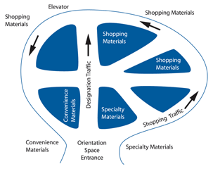
Incorporating Traffic Flow into Library Layout
Based on what you have read thus far, take a
look around your library and see if you can envision
this layout:
• It would be reasonable to display goods
and services that need to be brought to users'
attention at the front of the facility.
• To the right of the entrance should
be new acquisitions; items that might be selected
on impulse, such as fiction; items that fill
highly specific needs and have no satisfactory
substitutes; and items that require repeated
exposure before users select them.
• On the left at the front should be
items that probably will not be used unless
there is maximum convenience for the user, such
as the dictionary and the atlas and encyclopedia,
and items that have heavy demand.
• The circulation desk should be on the
left of the entrance, the last thing the user
passes before exiting.
• The rear of the facility should house
items for which user motivation is strong, such
as classroom-assigned materials and meeting
rooms, or for which the user is willing to spend
time and effort obtaining, such as microfiche
printouts. Also, materials and equipment that
take large amounts of space, such as computer
learning labs, should be at the back.
Retail Guidelines for Interior Layout
Based on customer traffic patterns, categories
of goods and services, and user behavior, retailers
have developed guidelines to use when designing
store interiors.1
I'll review these as they might be applied in
a library environment. Envision your own library
as you read through these, and continue to contrast
how your layout is similar and how it differs.
1. Main doorway is near the left side
of the front of the facility as the user approaches.
2. There is space at the entrance for
rapid orientation to the location of materials
and services.
3. Wide main aisle is at 45 degrees to
the right from the entrance, placed to utilize
the common right-hand reflex and to provide
easy movement for browsing and other shopping
behavior.
4. The main or 45-degree aisle is arranged
in a circular pattern to foster exposure to
all the materials and services available to
the customer.
5. Other aisles are arranged as hub and
spokes within the main aisle to provide access
to all parts of the facility.
6. There's an aisle from the entrance
straight to the back of the library for faster-moving,
goal-directed traffic and for separating browsers
from those with specific errands to perform.
7. The designer used wide angles and
curves in aisle arrangement in order to avoid
the interruption of mental search activity that
occurs at intersections in a grid pattern.
8. Transport to upper floors in a multistoried
facility is at the curve of the 45-degree aisle
at the right-hand wall and at the end of the
straight aisle at the back of the room in order
to facilitate speed and convenience of search
for materials.
9. Ramps have been used instead of stairways
in order to provide a smooth, clear path, thereby
minimizing interruption of users' mental search
process.
10. The circulation desk is adjacent
to the main entrance/exit and is on the right
as users leave the building. Materials are arranged
so that users' search time and effort is enhanced
and so that new and specialized materials are
brought to the attention of the relevant user
groups via placement and signs.
11. The designer has used wall color,
lighting, floor-cover design, and signs to identify
your products and to direct users.
This type of arrangement is constructed to maximize
ease of movement, access to materials, and visibility
to facilitate orientation.
When Are the Guidelines Best Used?
The principles can be employed in plans for
new construction or remodeling. In recent years,
many libraries of all types have been remodeled
because of emerging technologies. Librarians are
faced with the challenge and the opportunity of
participating in space redesign. Often the changes
are inexpensive and can largely come about by
re-thinking who your customers are and what goods
and services they are seeking when they come to
the library.
Now, take all that we know thus far and apply
it via this hypothetical school media center at
Leon High School in a small community of 15,000.
Example: Small High School Media Center
The Situation and the Problem: The student
body is only about 170 students in grades 8 through
12. Student traffic in the media center is relatively
constant throughout the day. Seniors have more
unassigned time than other students, and they
spend some of it in the media center. The media
center is easily accessible, and it houses the
school's computer learning lab. Computer searching
and special software programs are of primary interest
to the students. The circulation rate for materials
is low. The facility consists of a reading room
(20 x 30 feet), an adjacent office (10 x 10 feet),
and a darkroom (20 x 10 feet). The total space
is 900 square feet. The reading room houses a
collection of 3,000 hardcover and paperback books
and periodicals, filmstrips, and a rather large
assortment of equipment. There are partitions
throughout in an attempt to create separate spaces.
The staff is the media specialist and one assistant.
In the current facility, the acoustics are poor,
signs and aids for orientation are inadequate,
seating is limited, and organized class visits
must occupy the reading room. In addition, the
students tend to make more than the necessary
number of inquiries of the media specialist because
his office is just inside the entrance. Further
expansion is limited by administrative offices
on one side of the media center and the gymnasium
on the other. Despite these obstacles, student
enthusiasm for the media center remains high,
as it is a place to congregate and to access the
Internet.
Steps Toward a Solution: The media specialist
requested the addition to the media center of
an adjoining classroom that measured 600 square
feet. He also requested an adjoining office of
18 x 10 feet. The enlarged space is expected to
ease some problems with ongoing activities, and
it will enhance the regular daily use of the media
center for reference, research, and recreational
purposes.
Layout Guidelines for the Media Center: The
media specialist's request is granted, so now
he has another 1,680 square feet. The guidelines
and the new layout are prepared. The important
features of the new layout include the following:
1. Partitions are removed to provide
freer movement and better visibility.
2. The entrance is moved to the left
to permit a long 45-degree right aisle for the
shoppers. The main aisle follows a roughly circular
route around the reading room. The straight
aisle is for the errand-performing destination
users and runs from the entrance to the rear
of the facility to foster rapid and direct movement.
3. Seating for 34 users is provided,
enough for 20 percent of the student body (but
short of the 30 percent desired).
4. Heavy single-errand traffic for ready
reference and casual recreational items is served
at the front on the left. One dictionary is
there and another is at the convergence of the
aisles for the convenience of users in the seating
area.
5. The computer learning lab is partitioned
off at the rear for easy access from the destination
traffic aisle and minimum distraction of users
in the seating area.
6. The media specialist's office is at
the rear for good visibility to complement the
surveillance of the assistant at the circulation
desk. A second benefit of that location is that
casual interruptions of the media specialist's
work can be reduced.
The New Layout Is Positive: The new layout,
based on fundamentals of marketing, makes more
effective use of the available space. The arrangement
of materials, furnishings, and displays is designed
to complement the characteristics of users and
materials and the functions performed in the media
center. The new layout is a primary means of generating
media center use and user satisfaction.2
Some Libraries Already Employ Retail Layout
Recently, I had the pleasure of conducting a
marketing workshop and a keynote address (on the
subject of this article!) for the Kansas Library
Association, College and University Libraries
Section at the annual conference in Emporia, Emporia
State University. While I was there, Cindi Hickey
gave me a tour of the university library. Upon
entry and to the immediate left was a fine-looking
open reading space. The user is offered a delightful
moment of beauty and orientation. To the right
was convenient placement of the checkout desk
and offices, as well as a bustling cafe. A flight
of shallow stairs took us up to the reference
desk, allowing for quick traffic for shopping
and destination travel. Just upon first glance,
this library employed guidelines 1, 2, 5, 8, 10,
and 11.
How about yours? Take this article in hand.
Categorize your goods and services, consider user
behavior and current traffic patterns, and scan
the guidelines. Now walk inside the front doors
of your library and assess how your layout may
or may not be bolstering customer satisfaction.
References 1.
J. Barry Mason and Morris Mayer, Modern Retailing,
3d ed. Plano, Texas: Business Publications,
1984, pp. 680682.
2. Persis E. Rockwood and Christine
Koontz (Lynch), "Media Center Layout: A Marketing
Based Plan," in School Library Media Annual
1986 Volume Four, ed. Shirley L. Aaron and
Pat R. Scales: Libraries Unlimited, Inc., Littleton,
Colorado.
Christie Koontz, Ph.D.,
is a research associate and director of the GeoLib
Program at Florida State University in Tallahassee
(http://www.geolib.org).
Koontz also teaches marketing at the School of Information
Studies at Florida State University and conducts
marketing workshops around the globe. Her e-mail
address is ckoontz@admin.fsu.edu.
|

