FEATURE
Beyond the Bento: A New Discovery Experience at Smith College
by Rob OConnell
What’s Bento-Box Navigation?
“This model presents a dashboard of choices that delivers dynamic information on a single screen. Elements can then be interacted with to reveal more data. This works very well when using an app that aggregates multiple-data sources.”
—International Design Foundation |
Smith College is a small liberal arts college in western Massachusetts focusing on women’s education. The library is made up of three major departments: discovery and access; special collections; and learning, research, and technology. The discovery and access department maintains Smith College Libraries’ discovery layer, which is currently EBSCO Discovery Service (EDS). Like many other institutions, Smith College students use the discovery service in a variety of ways, from broad, topic-based searches to searching for known items, such as books or articles. This type of searching can lead to enormous result sets that end up confusing students and often leave them frustrated, as the results display can be unclear and the facet terminology can be challenging to understand. For several years, we’ve worked to improve the usability of the EDS front end, but it wasn’t until we decided to redesign our website that we undertook the steps to completely change how users discover our resources.
A Website Redesign and a Conference Inspire Change
In 2016, Smith College Libraries decided to rebuild our website, moving away from a search box using tabs to a single search box. The redesign would bring the libraries’ website into the 21st century, focusing on surfacing important information and streamlining access into our resources. In the process of reviewing our website, we focused on our discovery layer and exploring ways we could change the interface to become more in line with our redesign. I had just returned from an exciting EBSCO users group conference where representatives from the University of Alabama presented their new bento-box interface. They indicated that the university’s bento-box interface reduced the complexity of the EDS front end and provided users with a simplified look at the material they were searching. The implementation excited and inspired me, generating a number of questions, such as, “Wouldn’t it be great if users could customize their bento box instead of the librarians deciding what was important for them? And what if we could use all the same functionality of the EDS front end (such as faceting and sorting) and build that directly into a simplified bento box?” Thus began our journey into the creation of a dynamic, user-focused bento box.
What It Takes to Go Beyond a Traditional Bento Box
Before we began building the bento box, we considered how we would accomplish building a dynamic interface. Static boxes are one thing, but allowing users to pick and choose which boxes would display would be challenging. For this project, we decided to use two programming languages: PHP and JavaScript (jQuery). JavaScript allowed us to dynamically create boxes that could be added or removed on-the-fly. It also allowed us to use Ajax to insert the EDS data directly into these boxes as it became available, making it look like they were loading extremely fast.
Design was also extremely important for us. We opted to use Bootstrap to manage our CSS and implemented the design standards set by Google’s material design guidelines to ensure that our boxes were clean and content was readable. Google’s material design guidelines also put an emphasis on motion as an important part of the design process so we implemented the jQuery Masonry package, which allowed our bento boxes to shift and move as content became available. Additionally, the package also let users add and remove boxes with a simple click. After deciding what programming languages and design standards to use, we tackled the biggest challenge: working with the EDS API.
EBSCO has an enormous quantity of documentation on its website on how to use its API, including code samples. However, the challenge with building a bento-box interface is that you are not making one single request for content; instead, you are making multiple requests for different material types and databases. The EDS API also has an enormous amount of data that comes back and is often formatted with embedded XML and HTML tags. With these issues, we were forced to clean up a lot of the data before it was sent to the front end.
Usability Is Just as Important as a Flashy Interface
An important piece of building a bento box is reducing the amount of clutter on the screen and focusing on the core elements that users would want in their results. So what are some core pieces that a user would want to see? The first is obviously the title. The challenge with including the title is that some are extremely long, which can cause excessive scrolling. To mitigate this issue, we had a character limit, ensuring that the boxes stayed within a certain size. While we viewed the author as an important piece of the record, there often isn’t just one author, which can again cause excessive scrolling, so we left that for more detailed pages. Perhaps the most critical piece that we needed to be displayed was an indicator as to whether Smith College Libraries actually owned the item. Whereas Smith College is part of the five colleges, there are often records that we don’t own, which can lead to a lot of confusion. For example, when a user clicks on an ebook and Smith doesn’t own it, he or she will hit a login page preventing him or her from accessing the resource. To remedy this, we placed indicators that displayed if Smith owned the item and how many of those copies were available.
To round off our simplified display, we decided to include the year and material type. For articles, we included whether we own the PDF, as well as the source information and the number of pages, so that users can determine if they want to read or print the article.
Finally, a key component that we included was to ensure that users could have one-click access to the resources. If a resource indicated that we owned the PDF, clicking on the box would take them directly to the PDF.
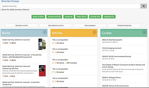
With design and dynamic functionality now in place, we were ready to go live. But first, we needed to decide which bento boxes would be initially displayed when a user started a search. We chose five boxes: books, articles, libguides, databases, and videos.
Usability Studies—Or Finding Out What Is Really Wrong With Your Interface
Our first round of usability studies focused on how students would use the bento box and the language we used to label functions. We had five students and two faculty members who tested a variety of different pieces of the functionality.
Usability testing surfaced interesting information and showed that some of our initial design features needed to be reworked. In general, users really liked the redesign; they were able to quickly locate books and articles and were able to easily scan for important information. Videos had mixed reactions, especially around determining what content was displayed. Many thought that videos from YouTube or other streaming platforms might be included and didn’t think the box would include DVDs or VHS tapes.
The most concerning boxes were databases and libguides. Our tests showed there was a lot of confusion around the content in databases. Most students tested didn’t understand why they would use the information displayed in the database box, and many couldn’t give a definition of a database. While this wasn’t a huge surprise, what caught many of us off guard was the reaction to the libguides box. Like databases, students couldn’t tell us why they would use a libguide or the definition of a libguide. After reviewing the results, we understood why they were confused. Broad terms resulted in libguides that were unhelpful or had no relation to their topic. Topics such as climate change brought up old libguides, and after scanning additional results, students couldn’t find anything that would help them in their research.
In addition to having challenges with the data that was displayed, students did not like the method to see additional results. Our initial design focused on showing only six results; however, when you wanted to see more results, you would be sent back to the traditional EDS interface. This was a jarring experience for our students.
 |
| The bento-box results display was first set to default to five boxes (including books, articles, and libguides), but problems surfaced. |
 |
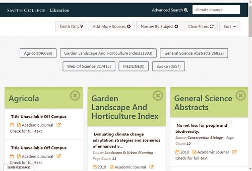
| Curated boxes connect subject terms with databases. |
Rethinking Our Process
With our first round of testing completed, we made some significant changes that would improve functionality and streamline the research process. The first change was to get rid of databases and libguides boxes, replacing them with the ACI Scholarly Blog Index (a subscription database) and the Digital Public Library of America (DPLA). The bento box was always designed to go beyond using the EDS API and was built with the ability to implement any available open API. The DPLA was viewed as an amazing resource that wasn’t getting enough publicity, so its implementation in the bento box seemed like a perfect addition.
The second major change was to get rid of the jarring shift from the bento box to the EDS front end when users needed more results. Instead, we implemented a slide-out bar that showed a scrollable list of results and allowed users to see the author, abstract, and full holdings information.
Perhaps the most exciting piece that we added was the ability to narrow results by subject. Students could use broad subject terms (such as archaeology, anthropology, biology, chemistry, or sociology) and see a list of boxes that had been curated by a librarian. We viewed this as a great starting point for students who didn’t know where to begin their research. It was also an important way to associate subject terms with databases. For example, the student may not know what content might be in Agricola, but when they clicked on the biology button, it could begin to associate subject terms with databases. Implementing these changes really improved our student usability with the bento-box discovery interface and allowed them to research easier and faster.
Designing for the Future
So what comes next for our bento-box interface? The first thing is to change our back end from PHP to Node/GraphQL. This allows our data to load faster and sends only the pieces we need from the EDS API to our front-end display. It also allows us to seamlessly integrate additional external services into the bento box, such as ArchivesSpace, BrowZine, and StackMap. The second is to move away from jQuery and start using React on our front end. With React’s focus on components, we can build cleaner, reusable code that can reduce the amount of coding we need to do. Lastly, we are looking at how we can combine our bento box with an advanced interface that would allow our users to keep their research in one interface and not have to worry about going to EDS for advanced features such as date filtering and Boolean searching.
While I haven’t mentioned analytics very much in this article, it will play a vital role in the future of the bento box. Understanding how our users search and which boxes they really need will allow us to make programmatic decisions in the future as to which boxes should be shown, based on what the user is searching. The bento box is an important piece in the Smith College Libraries discovery process and has enabled us to go beyond the abilities of the traditional discovery platform. As we continue to tweak our design and language, our hope is that users will find this tool a simple way to access and discover all of the information Smith has to offer.
|