FEATURE
Tips and Tools for Website Accessibility in Libraries
by Rachel Evans
| There is no need to reinvent the wheel when it comes to selecting a format and getting started. |
As a member of the newly formed discovery and digital services department at the University of Georgia’s (UGA) libraries, my project in my role as user experience librarian was to work with an existing team—a project manager/digital archivist and a developer—to develop user testing for a redesigned Finding Aids website for the university’s special collections. Additional projects have popped up, including testing the accessibility of a new institutional repository platform and leading focus groups of user acceptance testing for the library’s pending migration to a new ILS. For all three situations, although the flavor of testing and the goal were different and unique to each site’s user interface, the strategies and tools I used were similar. In this article, I share my experiences testing each platform, how I selected the tools, how I designed and structured how to gather user data, and what I learned along the way. My goal is that any librarian, no matter their title or the type of site they are testing, can take the following practical tips away from this article to apply to their situation for gathering useful user information and making data-driven design improvements for their library and its systems.
Tip 1: Understanding How User Experience Differs From Usability and Accessibility Testing
Although usability testing tends to focus on objective aspects of a system, such as reliability, usefulness, and efficiency, user experience (UX) includes both objective and subjective aspects. A 2025 article published in the Journal of Education and Learning sums it up well: “UX is a holistic concept … , it includes users’ attitudes, emotions, and psychological responses … , and it encompasses all interactions between users and the product, as well as the company providing it …” (files.eric.ed.gov/fulltext/EJ1478923.pdf). The discussion, research, and results in the article are specifically referring to learning management systems in higher education, but the concepts apply to each of the sites I was evaluating for usability as well—or, at least, mostly. With each project I was presented with, I recognized that every stakeholder group had a different goal; within that, not only were the sites serving very different purposes and providing access to different resources, but they were also intended for and would be used by different swaths of our university libraries’ community of patrons.
The takeaway? Whatever site or resource you are evaluating, ask up front what the goals are. This will allow you to widen or narrow the net you cast for the tools you decide to use and the format your testing should be. Even if your stakeholder is interested in usability or accessibility and not UX, the quality and ability of any given system in “facilitating teaching and learning processes is significantly affected by usability and user experience,” meaning that gathering subjective feedback is always helpful for considering the multitude of potential issues, as well as predicting and facilitating actionable solutions in a timely way. Although accessibility and usability are “two sides of the same coin,” as Usability Hub so perfectly puts it, the intersection of them is where the idea of universal usability arises. It means that the interface isn’t just meeting accessibility standards—it technically provides the same experience to users regardless of their physical or cognitive abilities. It also feels intuitive to navigate as well as efficient to work with or even enjoyable (lyssna.com/blog/accessibility-in-ux-design).
 |
| A summary of the tools I’ve relied on to run user testing group sessions |
Tip 2: Planning Your Testing So Your Timeline and Audience Inform Your Format
With my first project, testing for special collections’ new Finding Aids site, the small team of project manager/digital archivist and developer went a long way toward helping me ascertain background context of the site and understanding what improvements the new site aimed to make over the old one. Meeting with stakeholders and team members candidly can yield honest conversations about the potential biggest hurdles for end users. That information can contribute to choosing the right pacing for testing timelines, picking the best format for test delivery (virtual or in-person sessions and breaking tests down into segments of related tasks), and knowing what kind of data the team needs from you as the testing lead to turn any issues or concerns you uncover into actionable tasks for them.
If you have the time, the longer you can stretch out testing sessions to present them in smaller chunks for your group of users, the better. If you do not have that much time, but you do need to gather a lot of specific data from specific tasks, an asynchronous approach using forms or virtual discussion boards can help. This way, you can gather feedback from users as they are able to provide it, while still staying on track with the deadlines approved by your development or project team. For the Finding Aids site, although the go-live date was not until December 2025, we needed to complete initial user testing in the spring to maintain developers’ allotted time with competing projects.
For this project, I was very lucky the digital archivist/project manager who was most familiar with the site had a draft of the types of tasks to test as a Word document. She also had a timeline for starting and finishing testing, with specific date ranges. My role was to take these tasks from narrative form and create smaller segments to group the testing. Due to the demanding schedule of the archivists and librarians—the power users of this site—it was not conceivable to do in-person testing for these usability tasks. So, I located a template to adopt in Google Sheets, although you could apply it to any spreadsheet application.
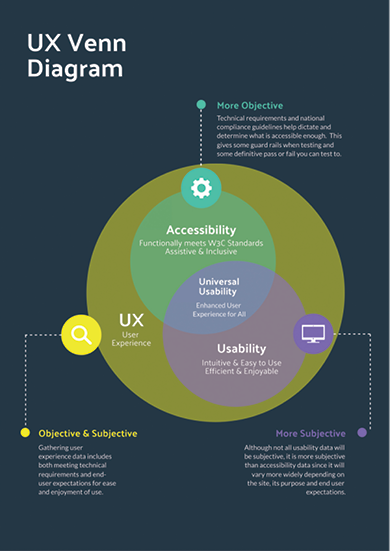 |
| This diagram, informed by countless others I have discovered,
helps illustrate the overlap of usability and accessibility testing
as they each relate to user experiences. |
Next, I created a series of Google Forms to break the longer set of tasks down into groups per form. One form served to gather initial data (what computer setup they were using to test with, both hardware and software, etc.) as well as tasks related to the homepage. A second form focused on testing the basic search function of the site, while a third one centered on the advanced search, and a final form dealt with reviewing metadata fields for record pages and related integrations to test. The four forms were shared with seven stakeholders for the first round of testing, later followed by some other testing with larger groups for gathering more-subjective data.
Tip 3: Choosing the Types of Tools for Gathering
Subjective and Objective User Experience Data
In the previous section, I mentioned that I found a template for user testing in the form of a Google Sheet. I had high hopes for leveraging that format and that template more than I was able to. But in the end, it still went a long way in saving me some initial work.
Spreadsheet Templates
There is no need to reinvent the wheel when it comes to selecting a format and getting started. Usability test designer Allie Ofisher’s template was just what I needed, and her Medium post highlighting the “mishmash” of techniques her team uses to prepare for and organize testing tasks and insights is an excellent starter read if you are approaching your own first user testing project (medium.com/@allieofisher/a-practical-way-to-organize-usability-test-insights-c6fb24cd5d1). She writes, “The most overwhelming thing when conducting multiple user tests is knowing what to do. … I eventually created a Google Sheets template … to help me prep for, conduct, and evaluate the results.” Ofisher’s post walks you through everything you need to know. If there are any aspects you don’t need, you can leave them behind and remove them when you make your own copy.
Task Cards
What I loved most about Ofisher’s Sheets template was that tasks populated a printable set of cards. Although I did not end up using printed cards for the special collections’ Finding Aids site testing, I was able to use a version of task cards in my next project for helping conduct user acceptance testing for the library’s migration to a new ILS. If you have a group in person, task cards can be an excellent resource to keep users on track and a nice way for them to be able to revisit tasks to practice later and continue supplying feedback after the session or focus group is over.
Google Forms
In lieu of task cards for the Finding Aids site, since I did not have a captive audience in person, I used Google Forms to populate the various sheets in my copy of the testing template. Google Forms smoothly connects the results to automate data in cells in which you can analyze and visualize the responses, and it also has a nice responses/results summary that generates some simple visuals, such as a pie chart for quickly assessing the data from any task.
Microsoft Forms
For user acceptance testing sessions with our catalog migration, we had a much larger set of librarians and staff members participating. With such a big group, we wanted more control over the responses and to track who the responder was. At UGA, we use Outlook and OneDrive tools, so the natural choice was Microsoft Forms. It allowed for authenticating users and limited responses to our organization while collecting email addresses. For this project, I created a form for each module in the ILS to test (which loosely coincided with departments, although some librarians or units would use more than one module of the ILS). This meant there was a form for circulation and inventory, a form for cataloging and electronic resources management, and a form for analytics.
Post-its and Padlets
Although we had some very specific user acceptance testing to guide us for pass-or-fail objective data with the ILS project, I also leveraged these groups (both in person and virtually) as opportunities to gather subjective user experiences. For the Finding Aids site with special collections, subjective data was gathered during a self-guided orientation—first using Padlet and later in two different listening sessions. Whether face-to-face, totally virtual, or a hybrid approach (since it can be hard to get entire departments together across a large organization; think circulation staff members from a variety of service point locations who have competing schedules and a lot of distance between their offices), you can use either or both to maximize the feedback you get. Even if your audience is fully face-to-face, some people may feel more comfortable providing feedback from their own device to a digital sticky note rather than standing up in person to place their opinion on the wall.
Extra-large Post-it pads are an excellent investment to stick to the wall of whatever room you use. Title each large pad with the task number and brief description of the task or area of a site the group is discussing/reviewing. Provide colored sticky notes and pens for the room. Digitally, the Padlet serves the same purpose. It is free to set up and can be portioned out as columns (as well as with other layouts) to visually mimic the room in person. It provides an organized place for users doing the testing to reflect on their experience with a task, link to an issue, share a GIF of how they are feeling about it, or even take and upload a screenshot to show their results, a button they couldn’t find easily, or something incorrect or missing from the site.
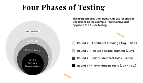 |
| This diagram shows the approximate timeline and phases of testing rounds as
well as format. |
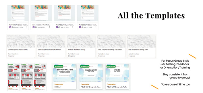 |
| The variety of templates for user testing groups in Google Forms, Microsoft Forms, infographics from Piktochart,
and slide decks |
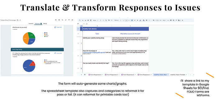 |
| The results from user testing in a Google Form automatically populate a Google Sheet to create issue and task cards with insights |
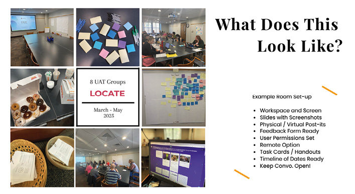 |
| The photos from a variety of user testing sessions and focus groups leading up to a catalog system migration |
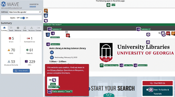 |
| The results of the WAVE accessibility tool on the University of Georgia’s libraries homepage |
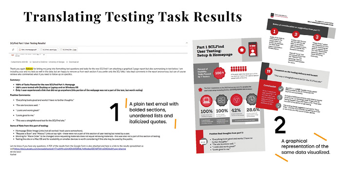 |
| The two formats of providing user experience results: as an email (left) and as an infographic with visuals (right) |
Slides, Teams, or Zoom
For each session of testing you conduct—again, whether it is in person, virtual, or hybrid—be prepared with a set of slides that serves as the overarching order of tasks. With an in-person audience, it provides a focal point in the room and can help keep everyone on task. With or without task cards, slides help pace everyone (yourself included) and can be timed with transitions or used with a separate timer so you don’t lose track of how long you have with the group. If the session is hybrid or virtual, having slides is all the more important so everyone knows which task the group is expected to complete. A benefit of using Teams or Zoom in addition to sharing screens and slides is recording a session. Providing a recording to anyone who missed it can help your users feel included in the testing process. This, in combination with the forms for asynchronous testing responses, can ensure that you get the largest possible number of responses and record the most data and experiences too.
WAVE and WebAIM
Last, but certainly not least—and as mentioned previously in this article—accessibility is always a part of the usability and UX equation. We often take for granted that a product our organization buys has been tested and should therefore be in compliance with accessibility standards because it has a price tag of a certain value. Surely, they wouldn’t sell us a product that isn’t compliant, or if they did, they would be responsible for fixing any accessibility issues we discover. It is always best to run your own tests for some basic web accessibility. There are several great tools out there, and I have used them to test our custom-developed Finding Aids site (using ArcLight), our vendor-developed institutional repository site (hosted in TIND), our library website (in Drupal), and our consortia-supported catalog and discovery layers (in FOLIO and EBSCO Discovery Service, respectively).
Utah State University hosts and maintains the WebAIM suite of tools (webaim.org/resources), which includes WAVE (wave.webaim.org). This free community service has been used to evaluate the accessibility of millions of webpages since 2001. WebAIM is a fantastic resource that offers free trainings, documentation, and more. WAVE gives a bare-bones report of structural site elements, including where a screen reader might trip up and what order it would read your webpage in, as well as contrast issues for colorblindness and readability.
Tip 4: Conveying User Experience Data to Developers and Stakeholders
Perhaps the biggest lesson in all of this is how to translate your findings into useful insights that stakeholders can make decisions with or pivot into discussions with developers so the results from a task with a user can turn into an actual improvement with the product. Collecting the data from the spreadsheet (via the forms) as well as the physical Post-it notes or digital Padlet output can seem daunting. It is helpful to know what ways your stakeholders, team, and developers communicate best.
A mix of percentages, with bullet points that pull quotes from the testing group, combined with graphs or charts, can present the information in a meaningful way. You want to tell a story about the user, not just the data, looking at what ways it impacted their journey to the resource and why it was successful or not. I have used both Piktochart and Canva to beautify the data alongside icons and in a layout that organizes the information in readable chunks. I attach these infographic-style reports to an email with a text version highlighting, bolding, or underlining the biggest points. Depending on the site and team or stakeholder, I may also attach a sample of the raw data for additional examples.
Conclusion
No singular approach will suffice when you are testing a variety of sites, platforms, or interfaces. One library’s need or level of testing for accessibility or usability may not be the same as another’s. Similarly, the user groups will be very different from one organization to another and from one product to another. I hope these tips that I have shared can be helpful in forming your own toolkit for your next UX project.
|