FEATURE
Telling Your Story: Using Dashboards and Infographics for Data Visualization
by Susan Gardner Archambault
| Data visualization allows libraries to communicate their message in a clearer and more effective way. |
Libraries routinely collect and evaluate data in order to respond to the changing needs of users. There are advantages to presenting data visually rather than displaying it as a set of numbers in a table. Our brains process visual information immediately and almost automatically, allowing for a faster way to communicate the message.
Introduction to Data Visualization
In Stephen Few’s 2012 book Show Me the Numbers: Designing Tables and Graphs to Enlighten, Second Edition (Analytics Press), he explains that some visual elements “pop out” of a display and are immediately detected by our brains. Two elements that facilitate this instant recognition are differences in color hue (e.g., red stands out in a sea of blue) and color intensity (e.g., a darker shade of blue stands out in a sea of light blue). Additional eye-catching elements include differences in shape (e.g., a rectangle in a sea of circles), size (e.g., a small circle next to larger circles), line length, line width, enclosure, and object position. Data visualization capitalizes on our innate visual processing capabilities by using these elements to allow people to process data faster and better.
The primary purpose of good data visualization is to illustrate what quantitative relationships are present in your data. Common types of quantitative relationships include nominal comparisons (differences in particular values), time series (how values change over time), ranking (the order of values), part to whole (percentages), deviation (differences from some standard value), distribution (how a set of values is distributed over a range), and correlation (whether two different values change together). Different types of charts are good at expressing particular quantitative relationships, and it is important to choose the most effective way to display your data. Scatter plots are best to show distribution or deviation; line charts are good at showing time series; pie charts are good at illustrating a part compared to the whole; and bar charts are good at showing ranking, part to whole, deviation, or distribution. The focus of this article is on best practice tips to help present data in a more effective way, with an emphasis on infographics and dashboards.
Tips for Better Data Visualization
The following tips are compiled from Priscille Dando’s 2014 Say It With Data: A Concise Guide to Making Your Case and Getting Results, published by ALA (American Library Association) Editions; Dona M. Wong’s 2010 The Wall Street Journal Guide to Information Graphics: The Dos and Don’ts of Presenting Data, Facts, and Figures, published by W.W. Norton and Co.; Edward R. Tufte’s 2001 The Visual Display of Quantitative Information, published by Graphics Press, LLC; and Tricia Clayton’s 2014 ALA webinar Dress Your Data for Success: Data Visualization Strategies for Library Assessment. One of the most important elements in data visualization is color. Use color sparingly and to convey meaning. Use different, high-contrast colors to represent different categories of data. Use a bright or dark color to make an important element of data “pop.”
When working with bar charts, you can shade bars from lightest to darkest for easier comparison. Avoid red for positive numbers since this color represents a “loss” in the business world. Be aware that using red/green or blue/yellow combinations makes it unreadable for the color blind, due to the lack of contrast in lightness. The three best color schemes to use are analogous (colors are near each other on the color wheel), complementary (colors are opposite each other on the color wheel, and the high contrast stands out), or monochromatic (when colors are all across a single hue to achieve visual cohesion).
It is also important to group, prioritize, sort, and sequence data before visualizing it to avoid plotting it in a random order. Line charts should be four lines or fewer and use increments that are natural and easy to count. Pie charts should have no more than five slices, with smaller slices combined into an Other category. The largest slice should be in the 12 o’clock position, with other slices ordered from largest to smallest going clockwise. Bar charts need to start at zero on the Y axis, so the data does not get distorted.
Infographics
An infographic uses visual images to represent data quickly and clearly. It usually combines textual and quantitative information to highlight key facts or statistics and tell a story or narrative. Infographics should reveal information that is otherwise lost in a crowd of data, and the message should be significant or surprising. It is important to choose the most appropriate chart type when displaying data in infographics. The most important information should be prominent, and decorations that detract from the main message should be avoided. One tool for creating infographics is Piktochart (magic.piktochart.com). Piktochart offers free templates and the ability to import your own data in XLS, XLSX, or CSV files; use Google Spreadsheets; or enter in your data manually. You can link, embed, email, or share your infographic on social media or download it as a JPEG or PNG file.
 |
 |
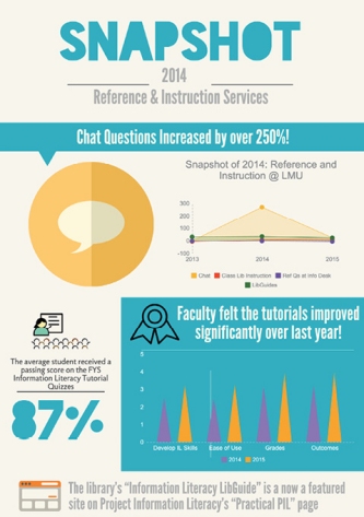
| Infographic 1, Snapshot 2014: Reference & Instruction Services, was created using Piktochart. The embedded line chart shows that chat questions increased by more than 250% while the remaining services saw little change. The embedded grouped vertical bar chart shows perceived improvement in the information literacy tutorials between 2013 and 2014. |
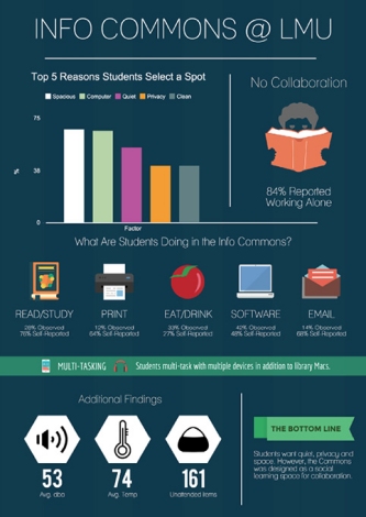
Infographic 2, Info Commons @ LMU, was also created with Piktochart. It highlights key findings from a study of Loyola Marymount University’s Information Commons space. There’s an embedded vertical bar chart and heavy use of pictograms to convey that students primarily want quiet, privacy, and room to spread out. Additional infographic tools that have both free and paid versions include Easel.ly (easel.ly), Venngage (venngage.com), and Infogr.am (infogr.am). |
Dashboards
Dashboards are defined by Few in his 2013 book Information Dashboard Design: Displaying Data for At-a-Glance Monitoring, Second Edition (Analytics Press) as “a visual display of the most important information needed to achieve one or more objectives, consolidated and arranged on a single screen so the information can be monitored at a glance.” Dashboards should stay confined within the boundaries of one screen and not provide excessive detail, while still making sure there is enough context for the data to be understood. As with infographics, it is important to display your data using an appropriate chart type, and you should use increments that are proportional to the actual measurements. The purpose of a dashboard should be defined ahead of time; common purposes include strategic marketing, planning/progress, and operational. The data in a dashboard is intended to get updated frequently and display trends, and it might be helpful to include a benchmark or goal for context. Data in a dashboard should be arranged so that the most prominent information stands out and data that needs to be compared is placed in close proximity.
Dashboards consist of a series of widgets that pull data from different sources. The data is displayed in a readable format using PHP and JavaScript. One free dashboard platform is Google Sites, which allows you to embed Google Spreadsheets.
|