Your answers to these four questions will help identify your needs and parameters of the test. The answers to these questions should be pretty straightforward. The most difficult question to answer may be the “how.” After seeing how the guerilla method can be applied to a variety of usability testing methods that are conventionally done in more formal settings, it’s important to pick the one that best suits your needs:
- Task analysis: Users work on one task or a series of tasks while their behavior with the task is observed.
- User interview: Interview users to learn about feelings, attitudes, or beliefs.
- A/B testing: Users are presented with two options and indicate their preferences, for example, about two interface variants: button color or language options.
- 5-second tests: Present something to a user for 5 seconds, such as a website interface, and see what is remembered to determine what stands out or is memorable.
- Card sorts: Give users cards to sort based on what makes sense to them, for example, menu options.
- Virtual tools: Test software, apps, and tools that gather user data or solicit feedback, such as analytics, heatmapping, or keyword SEO.
If you’re testing a website, you have the flexibility to perform the test with nothing more than a laptop and notebook for re cording observations. This makes it easy to meet users where they are. While each of these methods has its benefits and drawbacks, let’s focus on how to implement virtual tools using the guerilla approach, specifically heatmapping.
Heatmapping Your Website
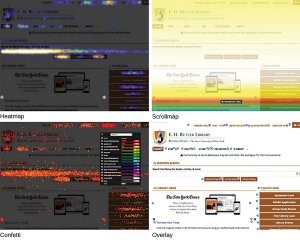 |
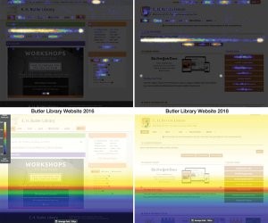
Figure 1. Four visualization formats
generated by Crazy Egg
[click for full size image] |
| |
|
Figure 2: Heapmap and scrollmap visualizations capturing the changes in usage between website revisions in 2016 and 2018
[click for full size image] |
When it comes to guerilla methods, there’s nothing easier than applying available virtual tools that capture user data without having to go through the process of recruiting participants and performing a test. The software runs in the back ground, and user data is gathered automatically. Compared to other virtual tools, heatmapping provides the most insight, as it incorporates analytics while simultaneously measuring more detailed user behavior.
Heatmapping tools use a software script to capture user data such as clicks, mouse movements, and scrolling patterns. There are a variety of heatmapping tools available on the market, including Crazy Egg (crazyegg.com), ClickTale (clicktale.com), Hotjar (hotjar.com), and Mouseflow (mouseflow.com). The one you pick will depend on your specific needs, budget, and technical expertise. At Buffalo State, the tool that best met our needs was Crazy Egg.
As the saying goes, “A picture is worth a thousand words.” That’s the idea behind heatmapping. Crazy Egg generates stunning visualizations based on user data. These visualizations make it easy to see exactly what content is most popular, allowing you to focus on the important things and make changes as needed without having to guess. Visualizations are especially helpful when it comes to link and content placement. Since libraries link to many external websites, it can be difficult to know exactly what users are doing when they visit our website. Crazy Egg allows you to track usage on both internal or external pages while providing analytics data such as referrer, time to click, device type, and browser.
Visualizing Data
Crazy Egg takes “snapshots” of your site based on your selections, such as the URL to capture, start/end period, desktop, mobile, and/or tablet view, and traffic. To start capturing data, simply select the plan that works for your library, install the script, set up your snapshot, then watch how your website is used. Data from snapshots is presented in five formats:
- Heatmap visualizes the most frequently clicked links, showing you the “hot spots” and “not-so-hot” spots of your website. The intensity of color correlates to the number of clicks a link receives.
- Scrollmap reveals how far users scroll down the page, allowing you to see what content gets attention both above and below “the fold.”
- Confetti displays the exact location and the metrics for each click. Colors change based on the selected metric.
- Overlay uses markers to indicate which elements on the page have been clicked. Each marker can be expanded to provide additional data, including new/returning visitor, referral source, and time spent, that helps uncover detailed user behavior.
- List reports click data in a tabular format that can be sorted and displayed.
Of all the output formats, the Heatmap snapshot is one of the most compelling visualizations generated by Crazy Egg. At a glance, it provides an easy-to-understand overview of what users are clicking on the site. It’s the most persuasive presentation of data. The Scrollmap is similarly compelling in that you can easily determine how much of your content is viewed by users. Making decisions about the placement or inclusion of content or links is simplified, as these two visuals can “speak” volumes in regards to what content is most popular with visitors.
Using both of these snapshots in a recent website update, we realized our header links weren’t being clicked, and valuable real estate was being taken up by an oversized image slider. These snapshots provided us the evidence needed to replace unused links with more targeted links, in addition to making sure important content in our news slider fit above the fold, guaranteeing visitors were seeing relevant and important information.
When it comes to hard data, both the Confetti and Overlay snapshots allow for granular data analysis and visualization. By selecting different options in the legend, you can analyze new versus returning visitors, referrer and search terms, device or operating system, browser, time of day, day of week, time to click, and more. The Confetti dots will change color based on the frequency of clicks and on the selected options and display the corresponding numerical values in the legend. Having both the analytics and mouse clicks data can be particularly helpful for better understanding different patterns or aspects of user behavior.
For example, you may notice that your users are clicking on certain links at different times of the day or days of the week. Confetti and Overlay snapshots could help drive decisions when it comes to the type and timing of services, workshops, or content posted on social media. Using this type of data to drive such decisions can help services or content be more timely, valuable, and relevant to your users.
At Buffalo State, we have been using Crazy Egg for a couple of years, giving us the ability to analyze how usage has changed throughout the academic calendar, in addition to redesigns of the website. We may observe that certain links are being clicked at the start of the semester versus the end of the semester or during the fall versus spring semesters. We may also notice significant changes in usage patterns with website up dates. Crazy Egg provides a tool to compare snapshots, making it even easier to spot trends or changes in usage patterns.
Tips to Avoid Going Bananas
When setting up a heatmap, Crazy Egg provides a number of options for each snapshot. Since library websites are most likely responsive, the interfaces and experiences of both are very different. Thus, it’s important to create individual snapshots for desktop, mobile, and tablet views—ensuring that we get an accurate visualization of user behavior. The visualizations generated by tools such as Crazy Egg are compelling representations of user data that usually speak for themselves. People are al ways shocked, amazed, and interested in viewing the visualizations. Use these visualizations to drive user-informed decisions to create the most user-friendly websites possible. The ability to compare how people use the library website at different points of the academic calendar—summer, fall, and spring—reveals that our users have different needs at different times.
As you implement guerilla usability methods in your library, it’s important to remember a few central principles:
- You are not your user. Don’t design based on your preferences: Design services and products based on user input.
- Test, fix, repeat. Usability testing is an iterative process. Guerilla usability affords you the ability to find errors and fix them quickly.
- Something is better than nothing. All research is good research, so even if it’s modest, a modest attempt is better than nothing.
As you consider the intricacies of UX and usability for library websites, remember that products and services must fulfill a need or solve a problem, not for librarians necessarily, but for students and faculty. With the guerilla method, your websites will reflect how users interact with your library and keep them from leaving in frustration.